Tuesday, 30 May 2017

NTU FASHION SHOW 2017

I recently watched the Nottingham Trent fashion design degree show and I was amazed at how talented the people are at this uni! I almost did fashion design here but decided against it last minute, I don't know if I am regretting that decision now and am having a change of heart! I miss it!

I took a few images of some of the collections, I didn't manage to photograph them all and it's not the best angle but I just wanted to share my thoughts with you all! From doing fashion design before I know how difficult and stressful it can be so it really made me appreciate the garments even more.
This was on of my favourite collections that I managed to photograph, not only did I love the pastel colour scheme, I loved the unique shapes created. The cuts and detailing in these garments was amazing! I also loved how each person chose their own music, it made it really fun and interesting.
I loved the addition of balloons to this collection, it made it really fun and they matched perfectly with the theme and colours!
Anything with frills, I love!
I really liked how feminine they made this menswear collection, it stood out to me because of this.
I thought this jacket was amazing, how on earth did they make this! It had so much volume.
The babydoll style and pink theme in this collection was right up my street!
I always find the puffer jackets so impressive.
I loved the crazy, bright, bold colours in this collection.
I honestly would buy this coat from a shop (if it wasn't coming into summer of course), the pieces looked so professional.
This collection really reminded me of Noa Raviv.
I remember seeing this gingham puffer jacket being made in the fashion room! It was so lovely seeing it finished and on the catwalk.
I was amazed by this fur coat, I don't understand how it was possible haha!

I didn't get many photos as I was busy admiring them all but I wanted to briefly mention it on my blog as I enjoyed it so much.

Thankyou for reading, 
Love from Georgia 
xxx
SHARE:

BEAUTY REVIEW- MARIO BADESCU ROSE WATER FACIAL SPRAY

Im sure many of you would have seen or used the Mario Badescu rose water by now. It is basically a natural, refreshing hydrating mist for the face. It is apparently for all skin types and is enriched with a blend of herbal and rosewater extracts. It really smells refreshing with a hint of rose which makes me feel really good about spraying it all over my face! It really refreshes and hydrates my skin. I think this product is perfect for the summer season too when you want a refreshing spritz on the skin that adds healthy benefits to the face. I use this before and after makeup, I have found that it makes my makeup go on better and acts as a good setting spray. I can't say enough good things about this facial spray. At only seven pounds I think it is a bargain. I can't wait to try other things out in the range.


I purchased mine from Urban Outfitters but I know that they also sell it on BeautyBay.

Thankyou for reading
Love from Georgia
xxx
SHARE:

MAKEUP REVIEW- TOO FACED NATURAL LOVE PALLET

My most recent makeup purchase is the amazing Too Faced natural love pallet. As soon as I spotted it I instantly knew it was me in a pallet and I had to have it. This is very natural in comparison to my other more recent pallets as they all seem to have bright colours and more mattes. I's say this is the perfect natural pallet for those of you who aren't as confident with trying out bolder, darker shades (however you could easily create some bold, nighttime looks with this too). Below is swatches of each shade, there is a lot of shades in this pallet and they are all reasonably sized. Definitely worth the money!

I do find that some of the shades are very similar (Satin Sheets, Kittens and Cutie Patootie) and they could have changed them up a little bit, however I will still use them all!

From bottom to top: Heaven, Fairy Tale, Nudie, Tickle Me, Don't Settle, Fingers Crossed, Lace Teddy, Satin Sheets, Push-Up, Honey Pot, Chocolate Martini, Undercover.

From bottom to top: Pink Cheeks, Kittens, Bunny Nose, Moonbean, Love Bug, Smokin', Poodle, Cutie Patootie, Dear Diary, Coffee Date, Spoiled, Night Fever, Spotlight, Honey Butter, Honeymoon, Hot & Bothered, Makeup & Chill, Stiletto.

Some of my personal favourite shades are Fairy Tale as it is the most glittery n the pallet and can be used to highlight the inner corner or add a little bit more sparkle to your look! Bunny Nose is probably my all time favourite as I love to wear pink! This shade is very pigmented and creamy with a little bit of shimmer. I find all of these shades so easy to blend. Honeymoon and Hot & Bothered pair really nicely with each other to create a shimmery orange/brown look that doesn't look too much. I haven't really used the matte or super dark shades that much but after testing them out, they all have a strong pigmentation and creamy consistency for a powder. I don't get much fallout overall apart from the most glittery shades (Fairytale, Cutie Patootie, Tickle Me, Honeymoon and Hot & Bothered) although, saying that, those are some of my favourite shades. I hope you found that slightly useful if you were considering buying this pallet, feel free to mention any more I could review.

Thankyou for reading
Love from Georgia
xxx
SHARE:

Saturday, 27 May 2017

NETFLIX SERIES- GIRLBOSS

I recently noticed a new Netflix series called 'GIRLBOSS' on my 'recently added' section and was so excited to find that it was in fact all about the one and only girlboss Sophia Amoruso! I am not lying when I say I completed the entire series in three days. I need series two! The series is based on an autobiography (#GIRLBOSS) of Sophia's life which basically runs through how she came about making her company 'Nasty Gal' successful whilst going about her busy, hectic, slightly troubled life! I absolutely loved the series and how it showed us just how rebellious she was (and probably still is!). I thought it was interesting showing us the troubles she had making her little eBay company so massive and successful, it definitely was not easy and it really hits home how much you have to put in to get what you want in life. It seems like she could have given up may times, but she didn't. The series takes us through the whole process of her story, even down to how she found her name 'Nasty Gal!' She seemed to (in the end) know exactly what she wanted but sometimes just struggled with how to get it.Image result for girlboss

The series was filled with humour with her casual stealing, lack of feelings for other people and just messiness all round with her small, dingy apartment and shitty jobs! I loved seeing the fashion in it with vintage shops appearing all the time. I won't be forgetting the jacket purchased by her in the first episode that seemed to inspire her so much! (She is wearing it in the image above), I think it makes such a statement and just described her personality straight away to me. I don't want to give too much away from the series, you must watch it! Especially if you admire Sophia Amoruso as much as I do!

Thankyou for reading
Love from Georgia
xxx
SHARE:

Friday, 26 May 2017

MAKEUP REVIEW- VIOLET VOSS HOLY GRAIL PALLET

I received this amazing pallet that I have been lusting over for a while for my birthday. I have had it for a while now to try out and let you all know exactly what I thought. I have included swatches to show the true colour payoff and shimmer. This is definitely one of my favourite pallets that I don't think I could live without now! The colours are very on trend with oranges and berry shades and there is a nice mixture of mattes and shimmers so everyone will feel comfortable using it.Image result for violet voss palette

I definitely have some favourite shades that I tend to reach for more. I am a shimmery pink lover so this pallet works really well for me! My all time favourite shade is 'So Jelly' purely for the iridescent, easily applied pink colour. This works well on its own as a wash over the lid colour or paired with other shades for a more complete look. I find 'On Fleek', 'Glamping' and 'Cranberry Splash' very similar but very creamy and easy to blend. I use these shades to deepen the shimmer tones in the crease of my eyelids or under the waterline for a more 'smokey' look if I am on a night out or something. 'Transition' is basically an amazing transition colour! perfect to start off the eyes with subtle shading and blending which can then be deepened with darker shades. I really want to experiment with 'Hashtag' more as the orange colour is so in at the moment, however I stick to my pink or gold shades normally, its just slightly out of my comfort zone! 'Cool beans' and 'Toffee' are used a lot too as they are easy to use and can be worn on their own easily if I don't have much time.

Swatches- 'Crystal'-'Wine and dine'.

Thankyou for reading
Love from Georgia 
xxx
SHARE:

POST PRODUCTION EXPERIMENTS

For our current fragrance brand project we all had to create some print adverts for our fragrance brands and after the photoshoot we had to think about what we could do post production wise. My group and brand focused on natural ingredients and wanted to attract the consumers with a healthy, natural, honest and handmade feel so that they could relate better to our brand. So, after a bit of editing and adjusting the contrast and brightness and backgrounds on photoshop we decided to use paint to get our ideas across. One of the girls in my group is amazing at painting so we wanted to use her skills to our advantage! We began painting into the flowers on the image and expanding them. We tried to be really experimental and colourful with our adverts. Below is a few examples of my attempts.

With a few adjustments and adding in of the logos and subheadings we created some quite unique print adverts that I think stand out in comparison to all of the very neat, perfect, slightly boring existing adverts!

Thankyou for reading
Love from Georgia
xxx
SHARE:

Monday, 15 May 2017

MAKEUP REVIEW: ANASTASIA BEVERLY HILLS 'SWEETS' GLOW KIT

I had been lusting over the 'sweets' glow kit in particular for a while now, purely because of the 'sassy grape' shade. I wanted a pink toned highlighter to match my usually pink, sparkly eyeshadow! I also thought it was different to the usual gold toned highlighters that everyone seems to stick with. I think this particular pallet is perfect for fairer skin tones, particularly with the marshmallow shade as this is extremely light, however the butterscotch and taffy shades are much warmer and perfect for summer or darker skin tones. I have swatched each shade to get an accurate colour representation on my paler skin tone.


Image result for sweets glow kit

So as you can see, these shades are extremely pigmented and give a strong glow/shimmer on the hand. The last shade 'taffy' is much darker than the others and I haven't really reached for it as of yet as it looks too dark for my skin tone, I am excited to use this in summer with a tan though! 'Marshmallow' and 'butterscotch' are classic easy highlighter shades to wear and look good with any makeup look. My favourite shade has to be 'sassy grape' purely because of the unique iridescent pink shade that looks amazing when the light hits it. It really changes my makeup up completely and is much stronger than the other shades. I would also say it is a cooler tone and is more on the silver side (rather than gold).

The packaging (although only paper/cardboard type material) is really sleek and clean. It has a slight shimmer to the colour and the actual size of the products is really good for the money. I completely recommend this glow kit to anyone, I don't seem to reach for any of my other highlighters anymore apart from my Anastasia kits!

Thankyou for reading,
Love from Georgia 
xxx 
SHARE:

Monday, 8 May 2017

PHOTOSHOOT IMAGES FOR OUR HAIR SMOOTHIE MIST

For our fragrance brand project each group has made their own brand and product up. Our brand is called Smooth and is a smoothie hair mist targeting millennial's who want a quick, natural fix to mask unpleasant smells as well as giving the hair added health benefits (much like a fruity smoothie would if we drank it). Our product also has a dial on the side to make the concentration of the scent adjustable and is cruelty free. So thats a very short summary of the concept we have been creating over the last couple of weeks! We recently completed out photoshoot for our brand which focused on the idea of the natural ingredients and the whole idea of a fun, exciting food fight with the props! It got very messy but we were overall SO happy with our final images. We will obviously continue editing the images in post production through photoshop and painting! (more images to follow). Below are some of our favourite images from the shoot.
So as you can see, our shoot was really fun, colourful and active. The fresh fruit, fresh flowers and bright fake flowers were great props and there was plenty of them! The juice from the fruit looked really effective when it was squeezed out and the leaves falling off of the flowers gave it a natural element which we all really liked. The models were amazing, they got stuck right in and didn't moan at all! Not even when we asked them to lie in all of the mess on the floor for the final photo! We asked them all to wear white tops for a pure, natural look and they had minimal makeup on too which was lovely and fitted in really well with the brand. I am very excited to edit all of these now!

Thankyou for reading, 
Love from Georgia
xxx
SHARE:

Wednesday, 3 May 2017

ALEXANDRA SHULMAN GUEST LECTURE

NTU were lucky enough to have a lecture by current editor in chief of vogue Alexandra Shulman last week at uni. I think everyone in the room was fan-girling big time! My ticket was booked for this event way over a month ago and I had been counting down the days until the day had arrived.

We gained a lot of interesting insights and what her job role was really like! She spoke about how relentless the job was and you never have a sense of achieving something because there is always something else to do and it doesn't stop! However on the 24th June she said she will probably wake up and wonder what on earth she has done! Shulman spoke about her decision to leave her job later on this summer after an amazing 25 years. Its crazy to think that I wasn't even alive when she had started her career at Vogue and her career has laster longer than my lifetime so far! She felt like she had the best final year with the centenary year, having the Duchess of Cambridge on the 100th cover, the BBC documentary and the collaboration with the National Portrait gallery. She talked about it being difficult to work with certain people sometimes but not getting on with people is part of the job. Even the Duchess of Cambridge had her own set ways when she had her shoot, she wanted it to be as natural as possible and not so over the top and royal!

Shulman's love of journalism was clear and this is probably something she will focus on now as she will have more time to herself. She is very proud of her book 'Inside Vogue' and described journalism of a way to tell your own story and how she sees it as a privilege to be able to tell people things. Her role in Vogue however was not to write it, not to style, photograph etc. It is to oversee everything and enable all of the people work together well which is difficult!

Shulman spoke about her own influences with David Bowie being one of them. His death had a massive impact on her as she grew up listening to him and his music. At the age of 14-15 music helps to form our identity and this is what Bowie did to Shulman, he was an influencer without trying and we all have our own influences. The issue dedicated to Bowie showing Kate Moss is one of her favourites.Image result for vogue david bowie cover

When someone questioned her on fictional portrayals of the fashion industry and brought up films like 'The Devil wears Prada' she said that it is a difficult industry to fictionalise, you can't make up anything that is better than the reality- this made me even more excited for future jobs I may have in the ever so exciting and competitive fashion industry!

Shulman described her own style as 'schizophrenic' and also spoke about how Edward will do when she has gone. Her own take on Vogue is very British and many people notice this, however Edward has been working in America, he has a lot of interest in diversity and is very into styling, this is something he is apparently very good at. Things will change but that isn't necessarily a bad thing.

Thankou for reading,
Love from Georgia
xxx
SHARE:

MET GALA 2017 BEST AND WORST

I'm sure you've all seen and judged this years Met Gala outfits and decided which ones you loved and which ones you hated. There was definitely a few to remember this year and a few to completely ignore and forget about because they were so boring and bland for the avant-garde theme! This is my opinion on some of the more popular and not so popular looks.
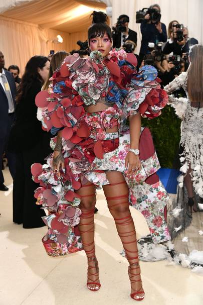
Rhianna seemed to be one of the only ones who actually stuck with the theme and I think she deserves credit for it! I remember looking at this exact garment a while back when doing my frills project, it's an amazing and interesting piece and she styled it well with the red lace ups and bright makeup. I wouldn't personally have worn this outfits (its wayy too out there for me!) but  Rhi Rhi always has to go that little bit further and stand out!

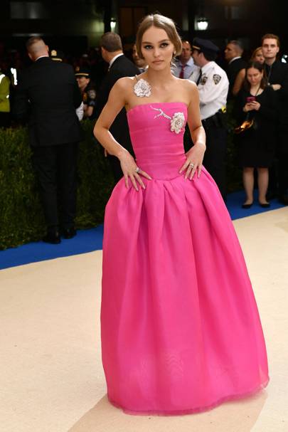
Bold, bright, simple and my favourite colour. I think Lily-Rose Depp cracked it in this gorgeous Chanel gown. I also love the simple embellishments on the shoulder and around the top. Hair slightly up was a good choice to show off the detail and the bold smokey eyes contrasted against the femininity of the outfit. She's also rocking a tan with this look, I feel as if that was a must with this colour! (I love to wear this shade on holiday when I have a tan!).

Yet again, Kendall and Kylie seemed to go for a classic shimmery, beaded, nude long gown, its just getting slightly boring now, Kylie's look isn't even interesting enough for me to talk about. Kendall seemed to go for a slightly bolder look by basically showing most of her bum but I really don't think it did her any favours, perhaps she was trying to outshine her booty-famous sisters? I found the shape odd and the back of it was completely bizarre to me. I completely appreciate the crystal covered gown and obviously Kendall has the figure to die for but I think the whole thing just looks cheap and tacky. Take the designer label and a few zeros off the price and I don't think anyone would look twice at it in Primark. I can't fault her hair and makeup though.

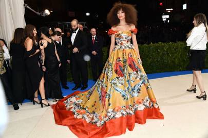
Zendaya was definitely talked about a lot after her appearance at the Met Gala. She stood out and looked very goddess-like in her bright, colourful gown. I don't love the big hair at all as it doesn't seem to go well with the look or dress to me but the bold orange lip and natural face match perfectly.

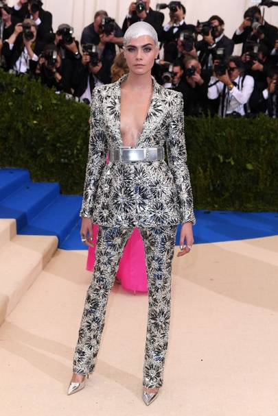
Cara's look baffled me to be honest. I get the whole bold, daring move by wearing a power suit (a gorgeous Chanel one to be exact) but the hair is just bizarre and SO wrong. She looks like something from a sci-fi movie, I just think it's too much, you don't need to go THAT metallic. I'm a girly girl and I love to look at all of the dresses worn but I do like this beaded, jewelled suit. The hair is just awful in my opinion.

Blake Lively's look was probably my favourite. She seems to kill it every year! And her and Ryan are couple goals. I think if the blue feathers on the bottom weren't there it would have looked more boring but the detail in this dress is insane! I also love how she paired some blue toned earrings to match the bottom of the dress, it really seemed to bring it all together.

Image result for selena met gala 2017
I thought Selena looked classic, simple and feminine. I adored her bright pink eye makeup and her cute little matching bag. I thought the chocker was unnecessary and made it look a but younger and immature and I can't help but think she could have picked some better shoes though, these seem a little bit old and outdated in my opinion.

I found Gigi's look a bit odd. I appreciate the asymmetric look of her custom Tommy Hilfiger gown but she didn't need to add some tacky looking stockings and cover half of her face with a strand of hair. I was so disappointed with this look as she usually always looks on point! The cut is odd and the colour is bland. I also thought her sister looked cheap in her Alexander Wang catsuit- very halloween esc.

Image result for hailey baldwin met gala
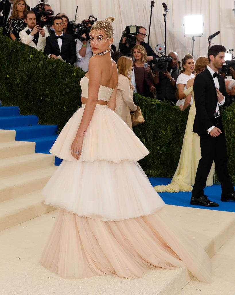
Hailey Baldwins dress was another one of my favourites. It was very feminine and girly and everything I love in a dress! It was very ballerina-like but reminded me of some of Victor and Rolfs designs which I also love! I loved the simple hair and makeup but thought the hair net was a bit too bride to be wedding themed!

Some were too wacky to talk about and some were too bland to mention but I hoped you enjoyed my thoughts on some of the outfits this year.

Thankyou for reading,
love from Georgia
xxx
Photo credit: Vogue
SHARE:
© GeorgiaLewisLoves.... All rights reserved.
BLOGGER TEMPLATE MADE BY pipdig