Tuesday, 14 June 2016

ART FOUNDATION END OF YEAR SHOW 2016

So as promised I have decided to post a few photographs of some of my favourite work by my fellow foundation students from the exhibition! Everyone's was so amazing and they all have such interesting thoughts and ideas behind them! I'm sad the art foundation is over as I have learnt a lot and made some great friends, but I am soo excited to go to university in September! I would 100% recommend doing an art foundation to anyone who doesn't quite know what they want to do or who just wants to take a year out creating crazy art!

I picked out some of my favourite work from the exhibition to show you all but there was soo much more amazing work!

This was one of my close friends work and I absolutely loved it! Her fashion illustrations in particular are amazing! Her work was based on cotton and cotton fields.
This girl based her work on the holocaust and she had soo many final garments! Her ideas were so unique and different which I liked. I also thought the plain colours made went well with the sad topic she based her work on.
I loved this work and the final garment in particular. The shapes and designs were so unique and well thought out. The boy that created this work got in to Central Saint Martins for menswear and I was so happy for him!
I loved how crazy this work was! The whole idea was based around personal space and the large bottoms of the dresses were created by inflatable rubber rings. This girl also did a film, showing her pumping it up and dancing in it which I wish I could show you!
I loved how this work was set out. She wanted people to focus on the details, hence why there was magnifying glasses on the garment and zoomed in circular photographs.
This was definitely one of my favourites, the photography is insane and it was all based around sweets! The film this girl made was also soo good!
This was work from one of my friends from visual communication, her work is amazing!
I just loved the dark rust and wood in this work!
This was in the 3D section and I just thought it was so cook how it was set out! I think these were cauliflowers!
This was another of my close friends work which was based on the colour indigo. She made all of the individual tags which were paper and metal which I thought were soo cool! I particularly loved the necklace she made, I would soo wear that!
I thought this work was cool with the light shining through the wallpaper, it created a new pattern on the other side of the wall which was interesting.
This was another visual communication students work and the work is so neat and precise! Its also so pretty with the colours and shapes!
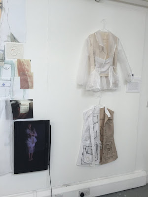
This is another of my friends work and another of  my favourites! Her work was based on pockets and the idea of  'get up and go'. Her giant illustration with her work incorporated was so eye catching and the film she created on the mini television explained her work well and showed off the pockets better!
I loved this work as it was such a cool idea! The paintings almost came to life as she painted on actual people! She also had a live model on the opening night walking around with the face paint on. I also love how it was set out like instagram posts!
Thankyou for reading!
Love from Georgia
xxx
SHARE:

Thursday, 9 June 2016

MY EXHIBITION

Our exhibition is finally open with all of our work in so I thought id add some images of my space. Our exhibition spaces vary in size and don't show all of our work, they mainly show the finished pieces or favourite work from part three of our course. Mine showed my dress, two tops, fashion illustrations and a detailed drawing on the wall. My work was very detailed and busy so if i added any of my other work in it would have looked messy and too much. Overall I was quite happy with how it all turned out and I cannot believe the art foundation year is finally over! Now we just have to wait for our results! ahhhh.

You can roughly see the background I created with black markers; I wanted to create a detailed, interesting background that linked well to my work instead of a plain one.
I have two previous blog posts that talk about this dress in a lot more detail!
The first top I created shows me burning twigs into it (like I showed in some of my samples) I like how closely this links to the idea of rainforests being burnt down.
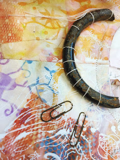
The second top shows gorilla glue dripping off, patches of different fabrics attached together and a rusty metal necklace dipped in more gel flex. I like the tops and they seem very textile based and experimental.
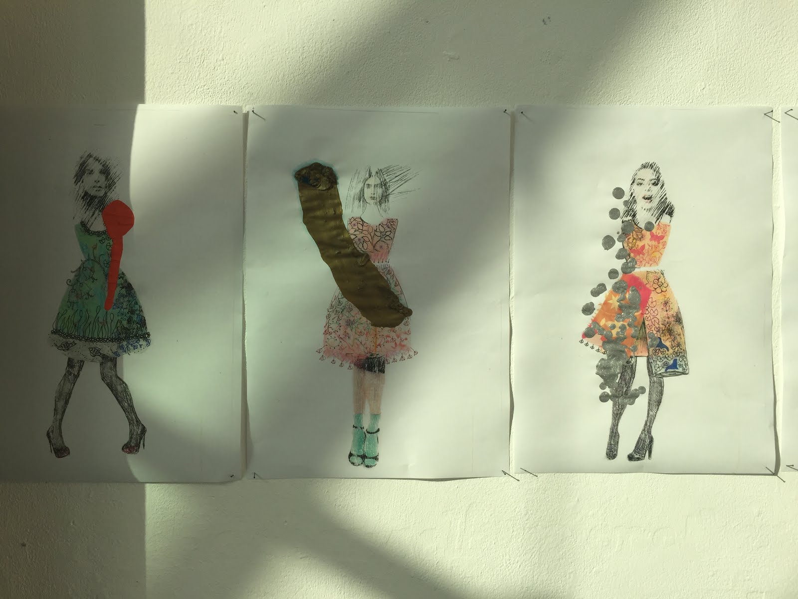
I had a row of six illustrations which I destroyed by splatting on clumps of paint and destroying the beauty again within my work.
Each illustration was completely different; I used techniques such as stencilling, chalk, scratching acetate, drawing and mark making. The techniques all created completely different effects which I loved.
Each illustration had the same similar shape to my main dress garment which I did by cutting out my own stencil. I found this technique extremely effective.

I hope you liked seeing my exhibition, even if the images weren't the best! If you're around Warwickshire then id definitely recommed going to see the show as it is open to the public for a week! I will be showing some of my favourite work from the exhibition in a blog post soon but it is soo much better in person!

Thankyou for reading, 
Love from Georgia
xxx
SHARE:

Friday, 3 June 2016

FINAL GARMENT AFTER DESTRUCTION

So as promised I am finally getting round to posting my images of my final garment after destruction. I have to admit, it was a lot harder to destroy it than I thought it would be! I didn't really want to ruin it in the end haha! However I think it turned out quite effective and I am pleased with the final outcome.

I decided to take my destroyed garment photographs in front of a more grubby, dirty background. I thought the silk screen wash room in my college would be a good and effective place to take the pictures in because of the contrasting black, dark background and all of the paint splats in the background which added a strange bit of colour and went well with the colours in my dress surprisingly! Once again my lovely friend was kind enough to model my dress for me and she did a fabulous job as per!

I used rusty metal, gel flex and stapling to destroy my dress as I thought these were three of my favourite and most effective techniques I have been using throughout this project. However, I decided to make two small tops so I could use more of my techniques, they are both in my exhibition as well which is next week! exciting!

I noticed how she wore black jeans before destruction against the white background and lighter white jeans after destruction against the darker black background, I love this contrast that we created by accident!
I attached strings to the arms so the gel flex would cling to it and it would look as if it was dripping down her arm.
As I have previously said, the red gel flex represents the blood of animals, my work will hopefully make people think more and feel uncomfortable when looking at it.
I asked her to look down and pick at pieces of the dress to show of the details more as some of them are slightly hidden if you don't look closely enough.
I love how you can still see the beautiful patterns underneath which took me so long, I didn't want it to be completely hidden.
I found a chunky piece of rusty metal near a skip (yes I went searching round a skip) and I thought it looked great as a statement piece around the neckline!
Even the pretty silk bow was destroyed!
I thought I'd zoom into some of the details and some of the steps I did before it was finished.

I created a scrap metal necklace last minute as well which I eventually dipped into the gel flex, this is attached to one of the tops in my exhibition.

The exhibition for everyone's work starts next week and I am so excited to see what everyone else has been creating for their final major projects! I hope to take lots of photos so I can show you all! 

Thankyou for reading, 
Love from Georgia
xxx
SHARE:

Wednesday, 11 May 2016

FINAL GARMENT BEFORE DESTRUCTION

I wanted to show you all my dress I have been making before I destroy it! I've really enjoyed making it the past few weeks and now that it's all put together, I almost don't want to destroy it! You will be able to properly see the detailed prints before they are ruined! I used the transfer press to create the beautiful colours and patterns and screen printed over the top of that with white paint to get the overall look and I am really happy with the outcome. It is very bright and summery, giving off a really positive, happy vibe. I added beautiful detailed images in with beautiful flowers and land animals and some images of the sea.

I had some help from my lovely friend Roseve who modelled my dress perfectly for me! She stood in front of a whiteboard which I drew some intricate designs on and added some fake flowers on top of that. She also had a flower garland for her hair and a bunch of flowers to make sure we showed off the beauty aspect and keep it extra bright! 

I really like the overall shape I went for with the simple skater dress style, although my favourite part is the large pleat in the centre, this gives it a completely different look and makes it a bit more unique. (inspiration for this style was taken from Mary Katrantzou's 2014 spring/summer collection which I have done a previous blog post on). I hope you enjoy looking at my photographs and what I have been getting up to lately on my course!

How pretty does she look!
I hope to use the whiteboard in my exhibition as I think it works really well with my garment.
The bunch of flowers go so well with the colours in the dress and the monochrome background.
     
We tried putting Roseve's hair up to show the top of the dress off a bit more, the flowers also sat better with a messy bun so I quite like the idea of keeping her hair up for other photographs.
I wanted to zoom into some of the details to show you as the imaged are one of the main parts in my whole project.
As you can see, I have added different animals into it.
The ribbon I added to the back has to be one of my favourite elements of the dress! I think it looks so pretty and girly and I love bows!
There will be more photographs to follow showing off the destruction elements to my dress, I can't wait to see what it looks like even if I am a little scared to ruin it!

Thankyou for reading, 
Love from Georgia
xxx
SHARE:

Wednesday, 27 April 2016

MARY KATRANTZOU SPRING/SUMMER 2014

Recently on my art foundation course we have all been finalising our ideas and designing our final garments. I have got my prints and designs sorted (I will be showing them soon don't worry!) but have taken a while on choosing what shapes I would like. I stumbled across this collection from 2014 and I instantly fell in love and found the shapes I wanted. I was torn between a long, silky, flowy dress or a shorter, more structured dress but after looking at this collection I have settled on a shorter dress using a satin fabric which has both structure and shine (perfect for my designs!).

I hope to recreate some similar shapes within my own work as I really like the shapes and structures within this collection.
This is probably one of my favourite shapes as I love the huge pleat in the centre of the dress. I also like the higher neck and the baby-doll style with the waistline not being emphasized as much.
This dress reminds me of co-cords, I really like how the top looks almost separate from the rest of the dress. It has multiple pleats which I really like and really interesting shapes on the sides.
I love the riffles at the top of the dress, this is something that I hadn't considered using before so it could be a good idea to look at. I also like the two layers, it looks so simple (but very complicated to make!).
This is a very interesting style and probably one that I won't be using, however the multi-layering and extra panels make it very unique and interesting to look at.
I like the strapless element to this dress and like how it uses multiple prints and almost looks like a coat or cape added to it. The shapes in this dress are some of my favourites.
I hope you like the shapes I have been looking at. I'm aware they are a bit wacky and extravagant for everyday wear but that's the look I am going for! I am going to take inspiration from these dresses and create some of my own styles and hope they turn out okay! Take a look at the others in this collection, there are some more lovely designs that i'm sure everyone can take some inspiration from.

Thankyou for reading,
Love from Georgia
xxx

Photo credit: www.vogue.co.uk
SHARE:

Monday, 18 April 2016

MORE DESTRUCTION OF BEAUTY TEXTILE SAMPLES

I wanted to include some more of my 'destruction of beauty' samples to update you on my foundation course work. I am still experimenting and deciding what I want to do for my final garments, however I have enjoyed using different, strange materials and want to carry on using most of the techniques I have discovered along the way! I love how most of my favourite ideas were discovered by mistake and by accidents I made along the way, this is what makes my project and the art foundation in itself so interesting!

I have included more transfer printing and silk screen printing, however this time I have added some more burning into my work and have refined my ideas more. My work is now starting to relate more to my ideas and I can see it all coming together a bit better!

I hope you like my samples even if they are a bit overly destroyed and strange! 

Print screen samples using multiple colours
Transfer print sample with gorilla glue. This expanded and changed colour as it dried which I wasn't expecting.
Transfer print cut with a scalpel, then dipped in black paint with pieces of rusty metal, this is supposed to relate to the pollution of the sea with oil spills and washed up deberry.
Ripped transfer print with twigs burnt into it. It was then dipped into brown paint to represent mud with more twigs sprinkled on top.
A ruined print screen copy with twigs burnt into it. I like the shape this created.
Negative screen print with pieces of wood burnt into it. My burnt samples represent burning down rainforests. 
Original negative teal screen print with wood added to it. I then print screened back over it in a lighter colour which stood out against the darker teal green. I also ripped the other side to add more destruction.
Screen print on silk with a sheer fabric folded over the top.
Screen print on stitched together silk using bright summery colours. I also added pieces of rusty metal as the rust colour went well with the oranges and yellows. I used the wire brush to destroy and fray the bottom.
Shiny silk transfer print with stapled together pleats and hole punches.
Instead of throwing away all of my scraps I decided to staple them all together, I really liked this effect and might experiment more with this sample.
Two transfer prints using silicone, I really liked the bright baby blue colour, however this didn't dry so I can't really see myself using this in future work.
I also tried out laser cutting which I really enjoyed. I drew my own pattern and then scanned it into the computer. I had to keep changing the settings depending on the thickness of each fabric. My favourite materials to use were synthetic silks and leathers. On the silk it made the fabric so delicate and almost lacey whereas on the leather it only engraved the pattern on. I am considering using this technique for my final garments.

So as you can see, I have tried out many more strange materials and techniques which I have really enjoyed using. I have many more I would like to try out before moving on to finalising my ideas and finally creating my final garments which we only have a few more weeks to do (scary!). Let me know what you think about my project so far!

Thanks for reading,
Love from Georgia
xxx
SHARE:
© GeorgiaLewisLoves.... All rights reserved.
BLOGGER TEMPLATE MADE BY pipdig