Sunday, 18 December 2016

CRUSHING ON VELVET

Velvet has been getting more and more popular the past few weeks and i have to say, I am pretty much obsessed. Especially with that blush pink crushed velvet effect (Yes I may have purchased a few items in this material). It hasn't just been popular in affordable high-street stores though.. the likes of Valentino, Roksanda, Alberts Ferretti and Osman are just a few designers that have been loving the trend for AW16. I wanted to pick out some key velvet items I have been LOVING recently and what I think is perfect for the winter, party season! 

Pretty Little Thing:
This dress it just my style, I love the cut, colour and texture of it. This is definitely going to be purchased by me very soon for the Christmas or New Year parties coming up! With some metallic or nude heels and a smokey eye and nude lip it will be perfect! Missguided are also doing very similar dresses with this material but this one is my fave.
Image result for pretty little thing velvet dress

Topshop:
Another dress I have been loving it this one! I actually own this one myself and have been loving wearing it. I like how it can be worn in the daytime with a long sleeved plain black top and tights or at nighttime with some strappy heels and a little bit more makeup on! A very simple dress but a key item in my wardrobe now! 
Image result for topshop velvet blue slip dress

Missguided:
I'm even loving the crushed velvet boots! I think this is a bit more of a bolder look to go for but nether the less, I still love it! I definitely want some of these in my shoe collection. I have seen quite a few pairs of crushed velvet boots recently but I particularly love this pair from Missguided.. my fave colour too!
Image result for missguided crushed velvet boots

New Look:
The classic black playsuit with a twist.. Just like a little black dress but a bit more fun! Everyone owns a classic black playsuit i'm sure. I love the twist on this one with the popular, in-trend chocker element and the subtle black velvet material. These two elements also seem to make this item more dressy and perfect for a night out. Topshop also do a similar style.
Image result for new look velvet playsuit

Puma:
Now I am not normally a trainer kind of girl but these Puma velvet creepers I would wear! Its such a girly, feminine thing to do to a trainer but I love it! Public desire are doing their own kind of version with some more funky colours.Image result for puma velvet creepers

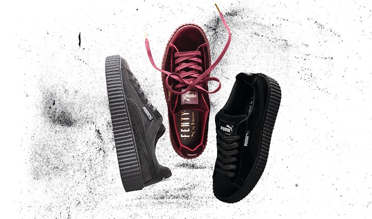
So there is just a snippet of the gorgeous velvet items out there at the moment. I am absolutely loving this trend at the moment. Let me know what you think of it in the comments down below.

Thankyou for reading!
love form Georgia
xxx
SHARE:

Saturday, 17 December 2016

SUMMATIVE BRIEF

All FCP students have recently been given their individual summative briefs which is basically everything we have done up to now, all over again, but on our own! (ahh). It will involve producing a report document created on indesign (not my strongest point!) as well as continuing with our sketchbooks, blogs and creative ideas! 
For the context part, we have each been allocated a fashion trend for Autumn/Winter 2016 which we will have to carry out primary and secondary research for. We will need to produce a 500 word report for this.

We have also been allocated a non-fashion brand and product for our Big Idea which we will need to document our brainstorms and ideas for in our sketchbooks (I have to admit, this was definitely my least favourite brief out of all of them!). We will need to define our chosen idea for the concept and brand combination and create a 15 word statement for it.

For the creative concept part we will need to create three mood-boards with three distinctive, alternative interpretations of the big ideas we came up with.

In the final execution part we need to pick one of the three big ideas created to develop. We will need to communicate our idea through a chosen social media platform and consider our target consumers whilst being creative and experimental!

The final thing we have to do will involve writing a 500 word report with illustrations and referencing. So as you can see it is quite a lot of work but very exciting at the same time. I have already started researching into my fashion trend which is the 'tough 90's' and am still baffled by my non-fashion brand and product which is is a soap dispenser and 'JML'! I hope to keep you updated throughout my research and new ideas I find along the way.


Thankyou for reading,
Love from Georgia
xxx
SHARE:

Friday, 16 December 2016

IM THE KYLIE YOU'RE THE KENDALL

I've just stumbled accross one of Kylie Jenners new items brought out recently and im not going to lie.. It has confused me a lot! I know Kylie Jenner is pretty famous and all and many young girls really do look up to her but no more than they look up to Kendall? Im finding this new T-shirt of hers slightly bizarre. To be honest, her new pop up shop on Instagram stocks some pretty weird items including her 'Kylie Panties' with her lip kit logo all over.. maybe she should have just stopped at the lip kits? Im not sure why anyone would want to buy them but each to their own.

The item i'm most confused by is her new T-shirt with the slogan 'I'm the Kylie, you're the Kendall'. I don't understand if its just some harmless inside joke between the two sisters or if it is just Kylie completely bashing her sister and saying she is better? Is she T-shirt dissing her sister? This top definitely doesn't have any positive connotations but I don't think she actually dislikes her bestie/sister does she? Being 'the Kylie' is a good thing of course but surely that doesn't mean that being 'the Kendall' is bad? Maybe its more of a 'you're the Kendall to my Kylie' type thing?

'Image result for kylie jenner im the kylie youre the kendall

Well whatever this shirt actually means, it is definitely a popular seller so Kylie must be doing something right! What did you think about it?

Thankyou for reading, 
Love from Georgia
xxx
SHARE:

Thursday, 15 December 2016

OUR GROUP PHOTOSHOOT

I wanted to document the process of our photoshoot for our execution process brief. We were given our editorial shoots which were analysed. We had Juergen Teller as the photographer, New Nomad as the theme and shoes as our object for our photoshoot. We had to create a series of three different photographs showing our theme and ideas in them all.

Our main idea was to create a story running through our images so we decided to show a 'night out in Nottingham' taking inspiration from the glitter party taken place at Rock City around freshers week. Our first image showed the getting ready part of the night out with clothes all over the floor, representing a typical girls bedroom before a night out. This was probably the most difficult image to get right purely because we had to do it indoors and were limited to how creative we could be in a little uni bedroom and kitchen! We chose many different patterns and textures to contrast against the classic black court shoes which we used throughout all three photographs. in the end our favourite image ended up being one that was taken by mistake! A happy accident.


We then decided to move on to one of our chosen locations which was right outside one of my favourite places in Nottingham- Ideas on paper! The courtyard space around this little shop was the perfect creative spot for ur second shoot. We wanted this image to represent a break in the night out with a girl either taking a cigarette break or just needing some fresh air!


We began distressing and 'ruining' the shoes a little bit by adding glue, confetti, glitter and dirt, this was supposed to represent what would have happened to a pair of shoes after they had been walking around a glitter party for the night. I really like the overall effect of this particular shoot and think that the strong colours from the confetti picked out subtle colours from the background, linking it all together and making it an overall stronger image. We tried many different poses and backgrounds but my favourite are the ones sitting down on the bars.


Our last images were probably the least visually appealing but they definitely told our story well! This photoshoot represents the end of the night out, the model has gone which adds an element of mystery (much like Juergen Tellers shoot we previously looked at). We wanted it to look like a messy night out so we broke the heel and chucked them near some bin bags- this gave both of them connotations of 'used trash'. We tried to take these images at nighttime to depict the similar timing and brightness of the images which I think worked well.


These are my three personal favourite images:


As a group we all picked the three images together and presented this: (the post it notes were positives and negatives from our fellow coursemates).


The images were set out in a similar way to Juergen Tellers shoot which we took inspiration from. We liked how they reminded us of disposable cameras and affordable, relatable family holidays so we decided to use a disposable camera on our photoshoot which we got some very good images from for our sketchbooks. We then also added the date on the bottom of each image just like a disposable camera would have. We changed the date throughout the three images showing the transition and journey of the night. Overall I really enjoyed this execution part of FCP as it allowed me to be more creative. Our shoot turned out well and I was happy with how it went in the short amount of time I had to create it.

Thankyou for reading,
Love from Georgia
xxx
SHARE:

Monday, 12 December 2016

PANTONE COLOUR OF THE YEAR 2017

So i'm sure you're all aware of Pantone's recently announced colour of the year for 2017. This new 'greenery' shade is supposed to signify new beginnings with the new year as well as hinting at the recently popular healthy food influnences and the nature/outdoors during spring and summer. I think this new colour is all about taking in a bit of the new fresh air and connecting ourselves with eachother and our environment. The yellow-green colour (Pantone 15-0343) seems to be a refreshing, positive, happy colour which I think is what people need sometimes, especially after a tough year.

I wasnt initially keen on the new shade purely because I adored 2016's 'Rose Quartz and Serenity' with the almost calming pastel shades (and if you didnt already know by now, pink is my favourite colour so theres no surprise I loved it so much!). After reading up on the shade more and noticing it on recent catwalks such as Gucci, Michael Kors, Bagelencia and Kenzo (just to name a few), i started to understand it a bit more.

Photo courtesy of Pantone.

'Buy less, choose well, make it last' -Vivienne Westwood.

This is a quote that partly influenced Pantone to pick greenery at 2017's colour of the year. This concept also influenced some of Westwoods own work. I didnt just pick this quote because I love Viv and her work, I also chose it to refer to exactly what greenery is about. Make better decisions in life for your fresh start. Make those decisions worthwhile and last well.

Greenery seems to like the 're words' (which since looking at the brand Radox for one of my small briefs, reminds me of shower gels and soaps!). However this shade is often used in refreshing cleaning products to revive, replenish, restore, reinvigarate etc. I think this is a very good take on life and the new year. It's signifying that new start and the re-do of the year! Let me know what you thought about 2017's colour of the year and the messages behind it.


Thankyou for reading, 
Love from Georgia
xxx

Photo credit: Pantone
SHARE:

Saturday, 10 December 2016

LITTLEMISSMATCHED

Whilst reading one of our required reading books 'Marketing Fashion' by Harriet Posner, one of the brands mentioned stood out to me from the 'remarkable marketing' section in chapter one. This section was all about making things worth noticing and making it unique. LittleMissMatched stood out to me because of its unique idea and selling point. The company was founded in the US by three people who wanted to create something wacky that would really stand out on the shelves. Their whole idea was to solve the problem of the missing sock!


Instead of selling the usual two in a pack, they instead sell three in a pack. If one goes missing or gets eaten by the washing machine then they can always rely on that trusty third sock. They have really funky designs and although none of the socks are a complete identical match, they all connect with the others in the set usually through the pattern or colour scheme. This brand is literally the opposite of boring with the crazy and colourful designs (you wouldn't be complaining about getting these socks for Christmas!). They initially wanted to aim their products to children and young teenagers but the designs have proven to be very popular with adults too! They have since broadened their range and now include hats, gloves, sleepwear, bedding etc, but I think their best product is definitely those funky socks!

Let me know what you thought about this brand?
Thankyou for reading, 
Love from Georgia
xxx
SHARE:

Wednesday, 7 December 2016

COLOUR PALETTE'S

A few weeks ago we learnt how to create our own colour palette's on photoshop which I actually really enjoyed, theres just something so satisfying about it! I decided to make a few more to show on my blog. They are so easily to create but look so visually pleasing at the same time. I decided to use images from my Pinterest account as I really like the images I collected of embellishments and embroidery (I have always been a big lover of a bit of sparkle!).


I hope you enjoyed looking at a little bit of what I have been getting up to, I will be posting much more content about the work on my course.

Thankyou for reading, 
Love from Georgia
xxx
SHARE:

Sunday, 4 December 2016

WEARABLE TECHNOLOGY

A recent article in the December 2016 issue of Vogue has really opened my eyes up to wearable technology. It is quickly entering the fashion world and people seem to love it! Ever since the Apple watches came out it seems as if everyone is upping their game! Including Michael Kors. The Michael Kors Access smartwatch has really caught my eye. Not only is is beautiful to look at with its rose gold colour but it is also such a new and clever device, this watch doesn't just tell the time for you.

Michael Kors Access Smartwatch

You can check through your notifications on it because it is compatible with iPhone and Android devices which I think is so handy for when you are on the go or just a stylish technology freak! I never really got into the whole Apple watch craze. I think it is probably because it didn't visually please me, it just wasn't my style. I already own a classic rose gold Michael Kors watch so I already know I love the brand and style. The Apple watches just weren't girly enough for me! A watch is something that everyone uses so I think it is so clever to modernise the classic watch and give people even more reason to want to purchase one!

The Michael Kors Access smartwatch also allows you to change the face as there are many to choose from. You can change and customise it depending on what mood you are in. It also allows you to change the watch strap so you can go from a daytime look to a nighttime kook in no time! I also feel like a digital watch can sometimes be quicker to read as I am so used to just checking the time on my iPhone if I haven't got my watch on. The watch also displays different timezones so if you are a bit of a traveller, this is clearly the perfect watch for you! I don't want to sound like a complete salesman but I just love this watch!

'The appeal of being stylishly connected while staying on top of my daily life gives a new allure to wearable technology'.  -Vogues Jo Holley 

Thankyou for reading,
Love from Georgia 
xxx

Photo credit:http://www.beaverbrooks.co.uk/designers/michael-kors/access
SHARE:

Thursday, 1 December 2016

THE EXECUTION PROCESS

Welcome back!
I have decided to start documenting my work a little bit more on my blog. We have recently just been given our latest mini project which is the 'execution' part of the creative process which is basically the finalised outcome. We have all been put into groups and have each been allocated a creative concept taken from an existing editorial shoot from the Vogue Archive which we will have to visually analyse and then research and respond to the original shoot. We were given a more contemporary shoot from the March 2015 issue. We will eventually have to do a photoshoot using inspiration from the images as well as an object we were given, our object has shoes which we were all quite happy with!

I thought I would go through the editorial shoot and show you what type of style we will be going for with our own photoshoot. The photographer of the shoot was Juergen Teller who is seen as a quite provocative, rebellious worker who focuses on the unexpected and untraditional aspects of fashion.


New Nomad to me has a free-spirited feel to it with people who might travel, want new experiences and who want to connect with their surroundings. I want to focus on looking at bohemian and festival styles when researching more into our theme. Although this is a more contemporary shoot to look at in comparison to other peoples, I still need to remember this is last year. Things like prints and velvet weren't as popular as they are now, Juergen Teller wanted to use unpredictable fabrics and trends which are now very popular in 2016. What girl doesn't own a crushed velvet item of clothing these days!


We noticed that the pages were set out like a printed photograph would have been (like disposable cameras). This makes it almost more relatable to the viewers who cannot relate to the expensive prices of the clothing shown on most pages. Many family holidays include the old disposable camera so most people can relate to this layout. It gives viewers a way to interact and makes it feel more personal to them. 


I found this image above a bit more typical and normal in comparison to the rest. It has a beautiful view and in comparison to the other one on the page, I just don't think it fits in as well. We tried to be critical as well when looking into the images as it will probably give us a better understanding of what we do and don't want to achieve in our own photoshoot. 


Plain makeup and crazy hairstyles are used. The 'no makeup' makeup look is repeated in every single photograph. We even noticed how an eight pound Loreal foundation was recommended to achieve this look which we found quite bizarre until we thought about how much Loreal were probably paying to be mentioned in this issue! They probably payed for the entire trip to the Greek island where it was set. 


When looking at the images we noticed that the two separate images on each page still connected, through colour. The same purple tone is used in the image above on both pages, making the magazine flow better and look visually pleasing. This is the same on most pages.


Some of the poses of the models mimic the backgrounds and surroundings, just like the one above with the girl in the tree, she looks wild like the tree as well as posing in a similar shape to the branches. The models pose in unexpected positions and go against the norm which I think Juergen Teller wanted to get across. They seem 'at one' with the nature around them. I think that because it is set on a Greek Island it is all about dressing a different way when you are in a different place. I don't know about you but when I'm on my holidays I really couldn't care less what I look like or what people think of me because I don't know them! I feel like you can be more experimental and be yourself!


Juergen Teller uses rural unexpected locations as opposed to other photographers around who strive for a perfected look to their fashion photography. He used natural, urban locations and used the surroundings as the props. I think this is so different to most fashion photography at the moment. There is a deliberate destruction of a typical fashion idea.

There will be more to follow on this project set! 
Thankyou for reading, 
Love from Georgia
xxx
Photo credit: Vogue March 2015.
SHARE:

Tuesday, 29 November 2016

LOUNGEWEAR AS OUTERWEAR

Recently over the past couple of weeks, I have noticed that comfy, indoor loungewear has made its way onto the streets and looks as trendy and fashionable as ever. I wouldn't have dreamed of going out the house in my tracksuit bottoms or loungewear before but it is becoming more and more popular and the fad is almost becoming a trend itself. Celebrities have been spotted rocking the trends and promoting the popular brands that stock the 'trendy tracksuits' on their social medias. Celebrities such as Samantha Faires, Megan Mckenna and Kady Mcdermot (and thats just to name a few!) seem to be loving this comfy trend. It seems very popular amongst the reality TV stars who make the typical, once 'chavy' tracksuit almost glamorous looking.


Megan Mckenna seems that obsessed that she has recently come out with her very own 'Sports Luxe' range on misspap. Im not entirely sure if I personally trust all of these celebrity endorsements but that is a whole other blog post!

Thankyou for reading, 
Love from Georgia
xxx
SHARE:

Sunday, 27 November 2016

NOTTINGHAM CONTEMPORARY- FOXP2

I finally got the chance to go and visit the Nottingham Contemporary earlier this week and saw the latest exhibition 'FOXP2' by Marguerite Humeau. I was pleasantly surprised at how interesting I found it. It was quite empty when we went so we were lucky enough to have a lovely lady who talked us through the exhibition and explained what it was all about. The exhibition was based around a mutation of a gene called FOXP2. This is the crucial 2% difference in our DNA between us humans and other animals such as chimpanzees. 98% of human and chimpanzee DNA is actually the same which I didn't know!

When we first entered the exhibition we were standing in a pitch black walkway with very strange sounds playing in our ears! I was a bit confused as to what was going on initially until I learnt more about it. It was essentially a synthetic voice beatboxing the origins of language, joined by 108 billion homo sapiens. This was probably my least favourite part of the exhibition as it was a little bit spooky and slightly bizarre. 


The rest of the exhibition was much brighter and covered in my favourite blush pink colour- definitely one of the prettiest exhibitions I've ever seen! I really liked the story and meanings behind the work in this room. All of the elephant sculptures were all facing the matriarch elephant 'Echo' who was slowly passing away. Each sculpture/elephant were reacting to this through different ways and emotions. For example 'Felicie' was a female elephant engineered to be self-destructive by getting drunk. Elephants actually get drunk with ethanol that comes from masala fruit- I found this so bizarre! The way it was shown was probably my favourite part of the exhibition as parts of ethanol were dropped into the water pump, this was pumping over and over whilst sounds were being played that the elephants would have made. I thought this was a really unique and clever way to show the different emotions. Another example of this is the elephant 'Enid' who was engineered to cry out of sadness. The mixture in this had depressant hormones mixed with three real drops of elephant tears which were sourced from a Thai zoo. 


Another really interesting part of the whole exhibition was the beautifully coloured carpet itself. The pink carpet was dyed with pigments created from chemical components of the human body. Overall, I really enjoyed finding out about this exhibition and having a tour guide really helped us understand what was actually going on! I would 100% recommend checking it out if you're ever in Nottingham.

Thankyou for reading,
Love from Georgia
xxx
SHARE:

Sunday, 20 November 2016

SARAH MOON 1983- MORGAN

For one of my uni briefs, we were each given an image we had to analyse. I was given Sarah Moon's 1983 image called 'Morgan'. At first I really didn't like my image as it wasn't a particularly pretty or girly photograph which I would usually much enjoy working with! However, the more I researched into it and found out about my image, the more I began to like it. I wanted to share with you what I found out about this image and to show just how important doing lots of research is! I would have never got into this brief and would have had nothing to write about my image if I didn't research it more! As a bit of background history on Sarah Moon, she was originally a model but she eventually changed to taking images of fashion photography as that was clearly a passion of hers.
 Image result for sarah moon 1985 morgan
The photograph shows an image within an image. As a viewer, I was instantly drawn into the small, brighter frame which the little girl was standing in. There is a slight focus on the rough, unpainted edge of the drop which the little girl seems contained within, however she equally looks like she is on the verge of stepping out of that frame and world and back into reality. There is a huge contrast between the two different worlds with the peaceful, natural forest against the dull, broken down buildings and derelict streets. There is a sense of loneliness in the image as both places feel so empty, this leaves me wondering what has happened or what the little girl is thinking so intensely about.

This colour isolated image with the greyscale effect initially scared me as it had a slight sinister look to it. I also think that the image could have a shocking and more powerful effect on viewers as a young innocent child is featured alone in an almost abandoned looking street. She doesn’t seem to be a typical happy child and looks like she has a lot on her mind which intrigues viewers as they want to know more.

I also feel like this photograph related well to fairy tales as I discovered that this visual text was Sarah Moons way of using photography to translate the tale of little red riding hood into a modern, urban context. This then reminded me of a book I studied at A-level called ‘The Bloody Chamber’. Particular stories in this book such as ‘Wolf Alice’ and ‘Werewolf’ borrow themes from Red Riding Hood, just like this photograph seems to. These stories also have a disturbing yet intriguing twist to them, the little girls aren’t always the victims and they don’t always need to rely on the typical woodcutter to come and save them, this child in the image is on her own and seems to be content yet deep in thought. Further researching also lead me onto Anne Ikhlef’s 1985 film ‘La veritable historie du chaperon rouge’ which was supposed to be the ‘real’ story of Little Red Riding Hood, which yet again had a twist.

The little girls outfit and appearance reminds me of Red Riding hood with her dark brown windswept bob and the short cape blowing behind her over the top of her tartan dress. This was also not the typical clothing worn by children in the 1980s when this image was produced. Brighter colours were worn and capes were not used. This would have been quite a shocking, different photograph to look at and I don’t think many people would have understood it if they didn’t look into the meaning behind it more.

There is a lot of repetition within this image with the shapes of the pillars, walls and doorframes in the buildings matching and flowing the same way as the tree trunks and branches in the forest. The whole image seems to flow into one even though they are complete opposite places. This makes the photograph slightly unclear, viewers have to look closely to notice the difference and it draws them in well.

The backgrounds in Sarah Moon’s photograph have a blurred, slight overlapped look to them with the busy backgrounds of trees and rows of buildings. This reminded me of graphic designer Hannah Guy’s work which I looked at for A- level. Hannah Guy took photographs of trees 360 degrees all the way around it to give the overall grey-scale images a 3-D, blurred effect. I felt like this had a very similar look to the forest image contained within the smaller frame. This effect has a mysterious feel to it, adding to the mystery of the little girl and what she is doing. The stories and images are unclear. Usually trees and nature have positive, peaceful, free connotations but this image is almost the opposite to that with the empty, urban alley being a distraction from it.

Thankyou for reading, 
Love from Georgia
xxx
Photo credit: google images
SHARE:
© GeorgiaLewisLoves.... All rights reserved.
BLOGGER TEMPLATE MADE BY pipdig